Wednesday, May 5, 2010


a flier a friend of mine made a few years ago. not sure if this counts as guerrilla marketing, but I've always found it clever/humorous.

Good Billboards


Speed Control


My dad sent me this a while ago, it was a campaign to slow cars down on busy roads. Not sure where its from though.

Tuesday, May 4, 2010


To introduce the TV show “The Practice” a two-way mirror effect was created in the restrooms of movie theatres.

Advertising Agency: Marcel, Paris, France
Creative Directors: Anne de Maupeou, Frederic Temin
Art Director: Alexandra Offe
Copywriter: Vanina Guillier
Published: March 2009

via http://www.ibelieveinadv.com/2009/06/jimmy-channel-two-way-mirror/

Thursday, April 29, 2010

Guerilla


This one is pretty fresh:


Great Guerillas


these are all pretty self-explanatory


guerilla promotions


Inspiration


Guerilla Promotion Examples


The first image is from the filming of the truth campaign to make people aware of the effects of smoking while pregnant. The second is a print campaign from truth about the chemicals in cigarettes.

The third is a bit different...just a sweet ad for windex.

Monday, April 26, 2010

Picture 1

my 826 collectors item. a poster that you can cut out and fold into a miniature fort. figuring out a template for a complex but still one piece fort was really tricky. I have a funny rough illustration for it there in the corner. would like to refine the illustration before printing this. what else could be fixed?

Wednesday, April 21, 2010

If anyone is up late and checking this....


you can do it!! yeahhh yeah yeah!

:):)

this will wrap around my packing tape (fort wall fortifier) as can be seen in my previous post. not sure about the black text (it says "1 roll of packing tape). threw that in at the last minute because I wasn't sure how to incorporate it and kind of wanted to refer to the repeated logo/information you often see on hardware 'packaging'.

also, I just reversed the orange rectangle at the bottom so the background is white instead of orange and the text is orange. (just didn't bother to take a new screenshot of it)

thoughts?


I'm going to make the packaging out of chipboard and have stickers or things that wrap around for the graphics. is this a good idea?
also, last week it was suggested that I try changing the pattern I was using, I made the rules thinner and closer together in hopes that they might start to read more as a different shade of orange than a pattern. the image below is just a screenshot of the new stripe pattern with the logo on top to get an idea of how the two things work together. thoughts? also, is there an easier way of making patterns like this than copying the lines and trying to place them evenly next to each other?

logo number 9 million


Am I getting closer with the logo? i think I like the stars in the bar better

logo help


I am having a hard time finalizing a store logo, am I getting close with any of these?

Package


Sticker for notebook & grape juice
and band for cards.


Also, I can't really decide on the color for the cards.
I like red, but it seems bit harsh on the eyes...
Some comments would be greatly appreciated.
Thanks.

Tuesday, April 20, 2010

possible collectors item

Chicken Packaging w/ updated story

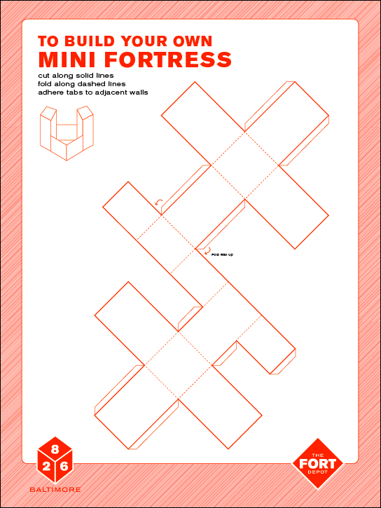
Chicken packaging! It is like a pedestal/base that turns the chicken into a bit of a trophy. Comments?

The Stuff of Dreams Packaging Update


Hangtag in black and white


Pearly whites in retainer case (if anyone in the class knows someone with one please let me know.)


5 pack of instant nightmare rescue pins.

Still to come:
- Is This a Test Dream Test?
- The Quick Release Parachute
- Takeaway - Dream Journal
- Solution for naked dreams - yet unamed

Comments and critiques welcome

I'm struggling with the idea that the arrows in my logo may conceptually be too sharp for a store that sells inflatable objects. Do you guys think that they are problematic?

Any other suggestions would be really appreciated. Thanks!