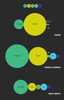

these are two variations of my poster. I feel like it is falling a bit flat and not a very compelling poster. I kept it simple because it is a fold out from a booklet that has the majority of the information about food deserts and the neighborhoods. Suggestions would be much appreciated.
For visual interest, the bottom solution is more compelling right now.
ReplyDeleteIt does feel flat, and like it's missing important information. It would be nice to have context on the poster (what is the infographic showing? what's a food desert), and a reason for the shapes chosen.
Circles are visually pleasing, but somehow it's not working as a unit right now.
There's something almost atomic about the way you've orbited the different elements, and perhaps you should play that up? Show interplay and interconnection between the categories, and it might liven this up.
Also, I'm not convinced that the key is working, and I feel that it would be more effective to put the categories in the circles since there is so much space, and use leader lines for the circles that are too small.
I prefer the top iteration, but still feel like I have no place to start on it. I want to be more directed in terms of how I "attack" the poster.
ReplyDeleteI agree with Ryan in liking the spacey aesthetic, but I'm not sure solid black is the way to go for the background. Maybe a tint or some sort of pattern would work better?
Add some more "small" or "easy" information to help the viewer understand what is going on before they digest the data. Right now the data is laid out really well, but I am sort of intimidated by it.
This comment has been removed by the author.
ReplyDeleteI agree with Jenna and Ryan in that the circles really are a nice, pleasing visual aesthetic, but there is a definite disconnect between the circles, the colors used and the content. The posters are beautiful, but a little bit arbitrary.
ReplyDeleteThink about how the colors and the imagery relate to the content, and how that imagery can make the piece more emotional.