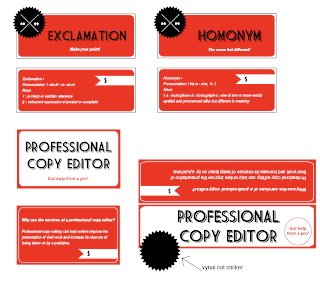
One of the suggestions that I got last week in class was to make my labels more dynamic, and to consider having the Copy Editor a bag topper type of label as opposed to a jar label. This is what I've been working on, and as my very detailed arrow shows, the black thing on the longer label would be a vynal cut sticker with the emblem that would overlap onto the plastic bag.
Also, I'm having trouble trying to find the "exclamation" pop rocks. Not the candy kind, but the ones that are wrapped in white paper and you throw against the ground. Does anyone know what they're called so I can order some?
These are looking pretty good, Claire, but I think your type needs some more breathing room. Perhaps try increasing the margins on your smaller copy and making your larger copy like 65-70% of its current size. It's especially problematic on the "Professional Copy Editor" labels.
ReplyDeleteAlso: http://www.skylighter.com/snappers-paper-fireworks-snaps.html
These are much improved.
ReplyDeleteTo echo Andy's comment, yes to more breathing room.
Also, watch your contrast. The black on red is going to be tricky to print and make work. Perhaps your text is white, and your shaded line is black to resolve this. I really like the look and feel of these now, and they are definitely headed in the right direction.
Your "Professional Copy Editor" on the left side is pretty comfortable in that amount of white space.